Brand Identity Design for Partnership for Housing Affordability
About Partnership for Housing Affordability
Project Objectives
Our Logo Creation Process
Discovery
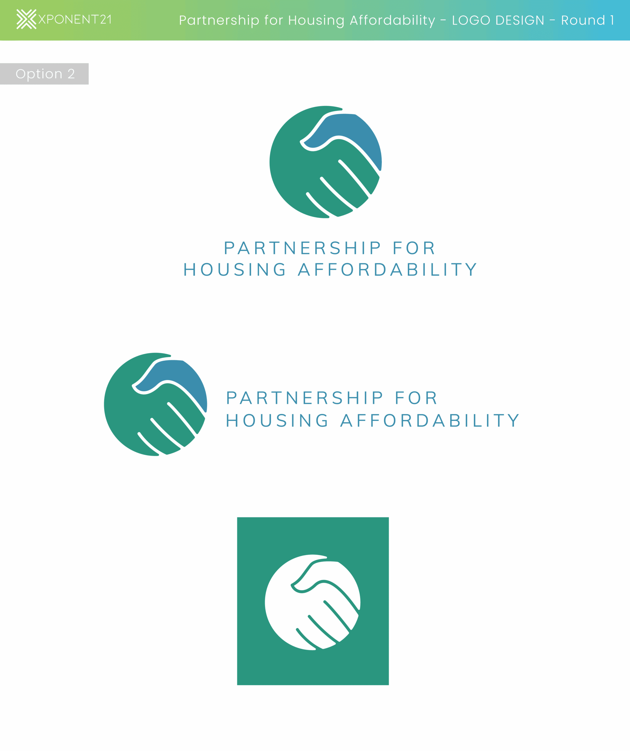
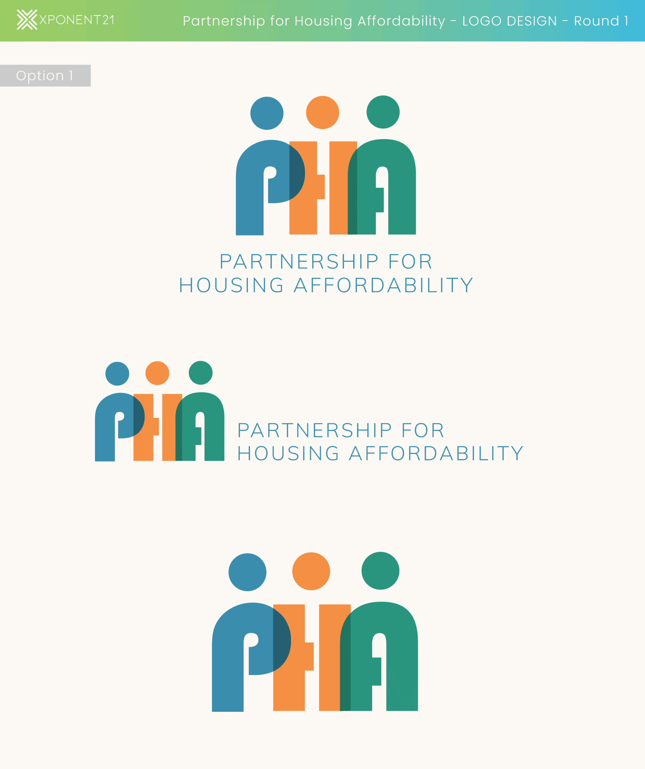
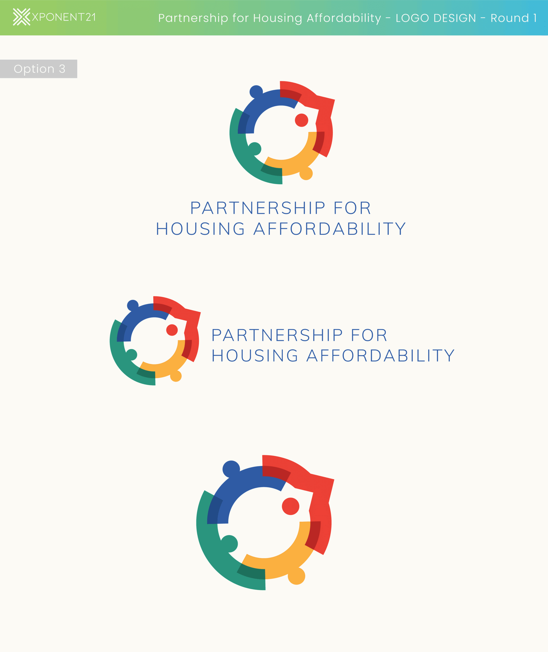
Idea Generation
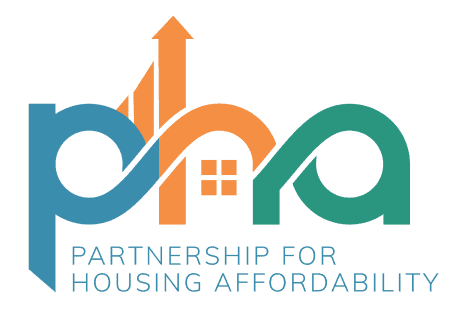
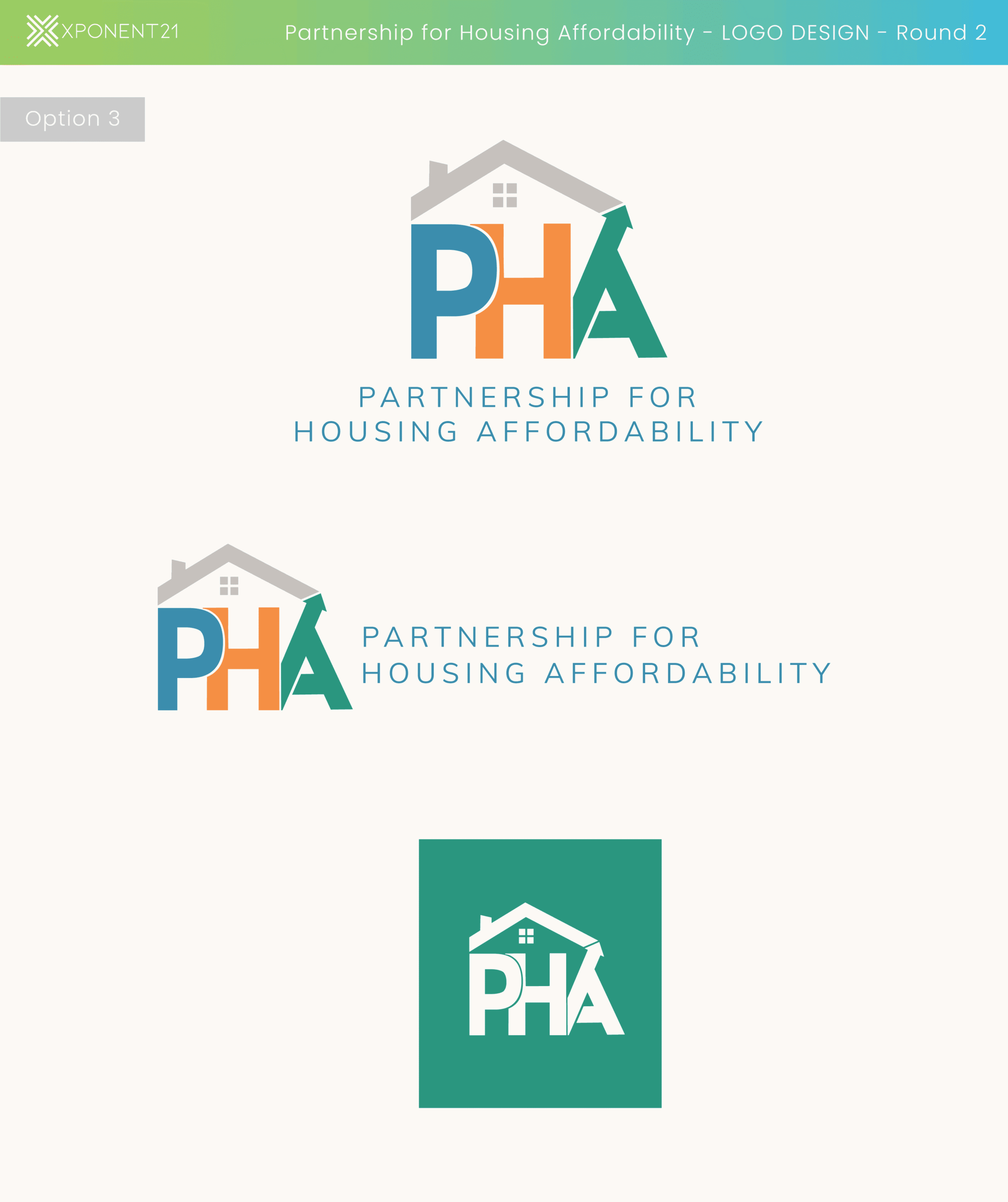
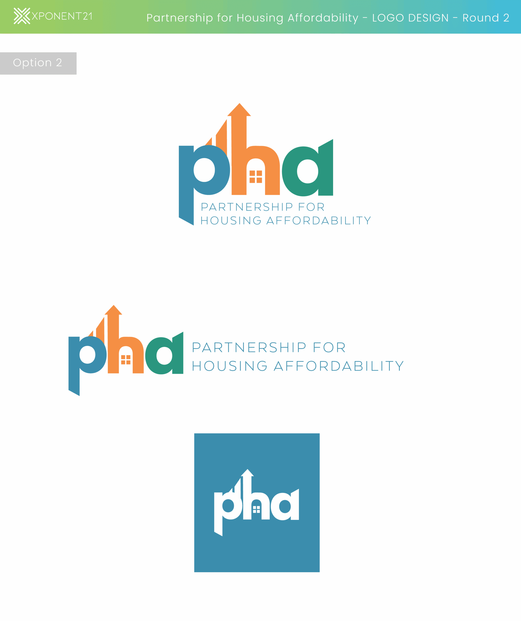
The design process begins with establishing the feel of the logo. To start we wanted the color choices in the logo to not just be visually appealing but are also strategically selected to align with the organization’s mission and values. Here’s a more detailed analysis of the approach to the color choices:
Blue: Blue often represents trust, stability, and reliability, which are essential qualities in housing and community-focused initiatives.
Orange: Orange is associated with energy, creativity, and warmth. It can also signify affordability and approachability, which aligns with the idea of making housing accessible.
Green: Green often represents growth, renewal, and safety, which are crucial elements in creating and maintaining affordable housing.
Development
Arrows and Lines: The upward-pointing arrow suggests progress, growth, and moving forward, likely symbolizing the organization’s efforts to improve housing affordability and access.
House Icon: The small house icon within the logo directly ties to the organization’s focus on housing. The windows and overall shape are instantly recognizable and convey the primary mission of the organization—affordable housing.
Interconnected Letters (PHA): The letters are creatively interlinked, indicating partnership and collaboration. This reflects the organization’s role in bringing together different stakeholders to achieve common goals.
Overall Shape: The rounded shapes of the letters and the flow between them suggest inclusiveness and unity, reinforcing the idea that the organization is about bringing people together for a shared cause.
Refinement
The Final Result