Client Location:
Richmond, VAProject Manager:
Courtney TurrinClient Website Link:
Partnership for Housing Affordability
Client Industry:
Education, NonprofitPortfolio Item Type:
Website, BrandingWebsite Features:
IDX/MLS Integration, Custom Calculator ToolProject Overview & Objectives
We had the privilege of collaborating with the Partnership for Housing Affordability (PHA), a cornerstone nonprofit dedicated to housing advocacy and research in the Richmond region. As PHA approached its 20-year milestone, they aimed to rejuvenate their brand with a fresh logo and enhance their website’s user experience.
Our mission was clear: to create a modern, accessible digital environment that mirrors PHA’s commitment to housing advocacy.
A few months after launching the new site, we once again partnered with PHA and Richmond Association of REALTORS®️ to support Henrico County’s first Affordable Housing Trust Fund initiative. This included adding an AMI calculator and MLS-integrated clearinghouse to connect income-qualified buyers with program-built homes.
Our Approach
Logo Redesign:
Our objective for the logo redesign was twofold: to encapsulate PHA’s expanding influence in the housing sector and to align the logo with the organization’s commitment to fostering affordable housing solutions. The redesigned logo is a visual representation of PHA’s evolution and its aspirations for the future.
At the heart of the new logo is the acronym “PHA.” The interconnected letters symbolize the unity and collective strength of the diverse communities PHA serves. This design choice highlights the organization’s role in bringing stakeholders together to address housing challenges.
The “H” is crafted with ascending lines that culminate in an upward arrow, embodying the concepts of growth and advancement. This represents reflects growth, progress, and PHA’s mission to elevate housing affordability as a priority in public discourse.
Website Redesign
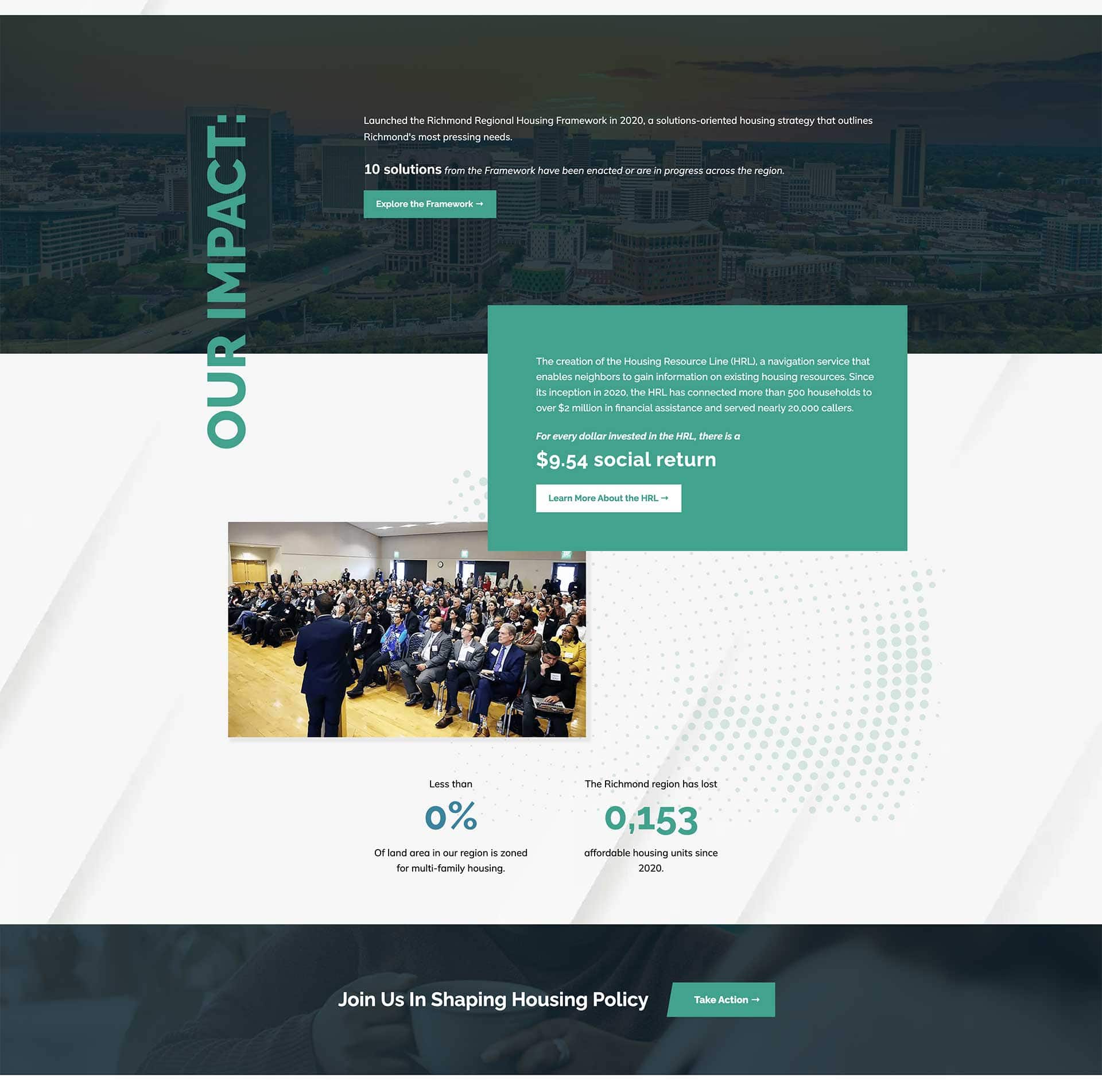
Richmond Nonprofit Website Redesign
PHA’s website needed a transformation to improve stakeholder engagement and data accessibility. Here’s how we tackled it:- Enhanced User Experience (UX): We improved the Housing Hotline Form by segmenting it into manageable steps, providing immediate clear feedback for queries outside PHA’s service scope.
- Integrated Donation Form: Transitioning from an external PayPal link to an embedded donation form, we offered donors a seamless experience. This change not only elevates the professionalism of PHA’s platform but also simplifies transaction tracking for the staff.
- Data Usability: We optimized the presentation of housing data to ensure stakeholders can easily find and interpret key information, enhancing its community value.
- Commemorating History: To mark PHA’s 20 years of impact, we added a timeline feature that highlights major milestones and their community contributions.
IDX / MLS Integration and Custom Calculator
For the Affordable Housing Trust Fund Initiative follow up project, we developed a calculator tool to assist buyers in determining their Area Median Income (AMI) level and assessing program eligibility. The calculator’s output was integrated with the MLS IDX feed to pre-filter property listings, displaying homes available to buyers based on their AMI level. To ensure only program-eligible homes were displayed, we implemented a custom filter within the MLS IDX feed that identified specific language in the property listing details.Key Results
The reimagined logo and website debuted at PHA’s annual State of Housing event in January 2024, celebrating the Partnership for Housing Affordability’s 20th anniversary with a fresh, modern brand.
This collaborative effort has enhanced visitor engagement, streamlined housing hotline inquiries, improved access to vital housing data, and simplified donor contributions—paving the way for more affordable homeownership opportunities.
The enthusiastic feedback from PHA and its stakeholders highlights the impact of this project in advancing their mission. We’re proud to have supported PHA’s work and look forward to seeing their updated digital presence drive meaningful change in the housing sector.
X21 Team Work
Our Services
- Branding
- Creative
- Design
- Content
- Development
- Digital Strategy
- SEO
How many team members collaborated on this project?
0

Partner With Us
Our clients are our partners. Together we’ll spark something amazing.
"*" indicates required fields

